CI
CI
Symbol Mark
Marine Harmony
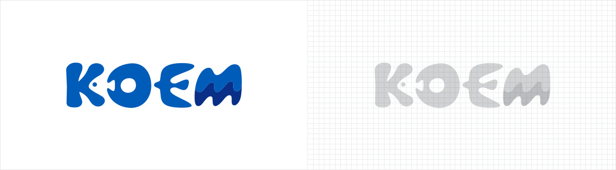
The logo design for KOEM was inspired by waves, marine creatures (coral, fish, seagulls), and the mineral resources of the ocean. It also expresses the harmony of the oceans and the ecosystems of creatures. The friendly feeling of the soft letters and the color blue were used to symbolize KOEM’s commitment to stand by the people of Korea to foster an ocean-friendly culture.
Signature
Vertical combination, horizontal combination
Main Color
- KOEM BLUE
PANTONE 300C
C 100% + M 44% + Y 0% + B 0%
R 0 + G 120 + B 193 - KOEM DARK BLUE
PANTONE 287C
C 100% + M 68% + Y 0% + B 12%
R 0 + G 83 + B 155
Sub Color
- KOEM LIGHT BLUE_A
PANTONE 2995C
C 90% + M 11%
G 164 + B 227 - KOEM LIGHT BLUE_B
PANTONE 291C
C 33% + M 3%
R 171 + G 217 + B 233 - KOEM MEDIUM BLUE
PANTONE 2945C
C 100% + M 45% + K 14%
G 105 + B 170 - KOEM LIGHT GREEN
PANTONE 317C
C 18% + Y 8%
R 209 + G 237 + B 226 - KOEM GRAY
PANTONE Cool Gray 9C
M 1% + K 51%
R 145 + G 145 + B 148